Income of the Aged Chartbook, 2012
- Definitions
and Notes
Total Money Income
Income Sources- Family Income of
Persons 65 or Older - Poverty Status, Based
on Family Income
Total Money Income
The demographic composition of the elderly changes with age. Aged units 65 to 69 are the most likely to be married couples (50.8%), while aged units 80 or older are most likely to be nonmarried women (53.0%). The younger age groups also have a greater proportion of minorities than the older cohorts.
| 65 or older | 65–69 | 70–74 | 75–79 | 80 or older | |
|---|---|---|---|---|---|
| Marital status and sex | |||||
| Married couples | 42.5 | 50.8 | 49.0 | 43.6 | 28.1 |
| Nonmarried men | 16.9 | 17.6 | 15.2 | 14.6 | 18.9 |
| Nonmarried women | 40.5 | 31.6 | 35.9 | 41.8 | 53.0 |
| Race | |||||
| White alone | 84.4 | 82.8 | 83.5 | 85.2 | 86.5 |
| Black alone | 10.1 | 11.0 | 10.9 | 9.5 | 8.8 |
| Asian alone | 3.8 | 4.1 | 3.7 | 3.5 | 3.7 |
| Hispanic origin | 7.7 | 8.7 | 7.2 | 8.4 | 6.5 |
| Total number of aged units (thousands) | 32,667 | 10,178 | 7,372 | 5,593 | 9,524 |
| NOTE: Totals do not necessarily equal the sum of the rounded components. | |||||
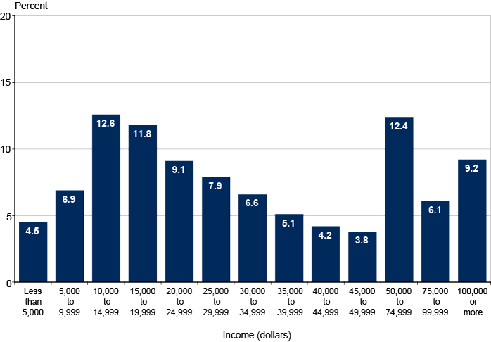
The aged are an economically diverse group. The median income for units aged 65 or older is $28,056, but there are wide differences within the total group. Approximately 11% have an income of under $10,000, and roughly 28% have an income of $50,000 or more.
| Income (dollars) | Percentage of aged units |
|---|---|
| Less than 5,000 | 4.5 |
| 5,000 to 9,999 | 6.9 |
| 10,000 to 14,999 | 12.6 |
| 15,000 to 19,999 | 11.8 |
| 20,000 to 24,999 | 9.1 |
| 25,000 to 29,999 | 7.9 |
| 30,000 to 34,999 | 6.6 |
| 35,000 to 39,999 | 5.1 |
| 40,000 to 44,999 | 4.2 |
| 45,000 to 49,999 | 3.8 |
| 50,000 to 74,999 | 12.4 |
| 75,000 to 99,999 | 6.1 |
| 100,000 or more | 9.2 |
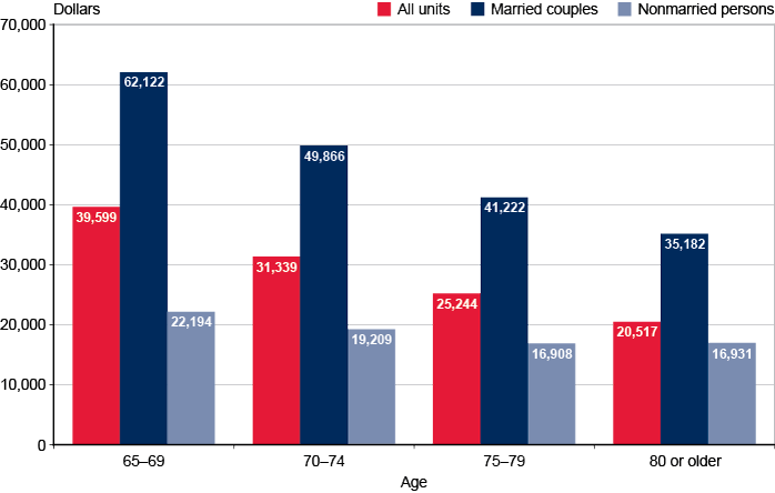
Income differences by age are associated with differences in marital status. Median income is generally lower in older age groups. The striking differences by age are due in part to the disproportionate number of nonmarried women in older age groups.
| Age | All units | Married couples | Nonmarried persons |
|---|---|---|---|
| 65 to 69 | 39,599 | 62,122 | 22,194 |
| 70 to 74 | 31,339 | 49,866 | 19,209 |
| 75 to 79 | 25,244 | 41,222 | 16,908 |
| 80 or older | 20,517 | 35,182 | 16,931 |
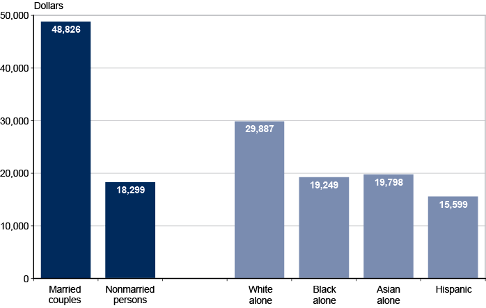
Demographic differences are associated with different levels of median income for units aged 65 or older. Income is highest for married couples, who have a median income more than 2½ times that of nonmarried persons. Median income of white aged units is greater than that of Asian aged units and black aged units by 51 and 55 percent, respectively.
| Characteristic | Income (dollars) |
|---|---|
| Marital status | |
| Married couples | 48,826 |
| Nonmarried persons | 18,299 |
| Race | |
| White alone | 29,887 |
| Black alone | 19,249 |
| Asian alone | 19,798 |
| Hispanic origin | 15,599 |
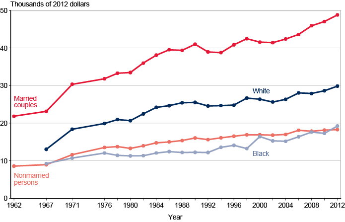
Median real income has risen substantially over the years. Between 1962 and 2012, the income of units aged 65 or older increased even when adjusted for inflation. The increase was 123.4% for married couples and 113.0% for nonmarried persons. There were disproportionate increases by race. Between 1967 and 2012, the income of whites increased by 128.6%; that of blacks increased by 108.4%.
| Year | Married couples | Nonmarried persons | White | Black |
|---|---|---|---|---|
| 1962 | 21,857 | 8,591 | -- | -- |
| 1967 | 23,186 | 8,978 | 13,074 | 9,239 |
| 1971 | 30,374 | 11,616 | 18,402 | 10,731 |
| 1976 | 31,836 | 13,558 | 19,933 | 12,065 |
| 1978 | 33,312 | 13,769 | 20,987 | 11,444 |
| 1980 | 33,492 | 13,319 | 20,675 | 11,313 |
| 1982 | 35,997 | 13,990 | 22,484 | 11,373 |
| 1984 | 38,118 | 14,783 | 24,219 | 12,087 |
| 1986 | 39,571 | 15,041 | 24,677 | 12,464 |
| 1988 | 39,407 | 15,386 | 25,457 | 12,233 |
| 1990 | 41,021 | 16,068 | 25,545 | 12,274 |
| 1992 | 38,975 | 15,635 | 24,586 | 12,213 |
| 1994 | 38,800 | 16,120 | 24,712 | 13,591 |
| 1996 | 40,891 | 16,538 | 24,809 | 14,120 |
| 1998 | 42,504 | 16,924 | 26,699 | 13,260 |
| 2000 | 41,583 | 16,953 | 26,386 | 16,444 |
| 2002 | 41,426 | 16,833 | 25,657 | 15,315 |
| 2004 | 42,418 | 17,015 | 26,374 | 15,196 |
| 2006 | 43,623 | 18,140 | 28,082 | 16,400 |
| 2008 | 45,947 | 17,869 | 27,915 | 17,656 |
| 2010 | 47,084 | 18,174 | 28,654 | 17,334 |
| 2012 | 48,826 | 18,299 | 29,887 | 19,249 |
| NOTE: -- = not available. | ||||
Income Sources
Social Security is the most common source of income for units aged 65 or older. Nearly 9 out of 10 aged units receive Social Security benefits. Asset income is the next most common source of income, received by more than half of the aged. Two-fifths receive retirement benefits other than Social Security, and more than one-quarter have earnings. Public assistance and veterans' benefits are each received by less than 5%. Noncash benefits, including SNAP benefits and housing and energy assistance, are received by almost 12%.
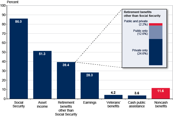
| Source of income | Percent |
|---|---|
| Social Security | 86.0 |
| Asset income | 51.3 |
| Retirement benefits other than Social Security | 39.4 |
| Public and private | 2.2 |
| Public only | 12.6 |
| Private only | 24.6 |
| Earnings | 28.3 |
| Veterans' benefits | 4.2 |
| Cash public assistance | 3.6 |
| Noncash benefits | 11.6 |
Social Security provides at least half of total income for a majority of beneficiary aged units. In 2012, 86.8% of married couples and 85.6% of nonmarried persons aged 65 or older received Social Security benefits. Social Security was the major source of income (providing at least 50% of total income) for 52.3% of aged beneficiary couples and 73.8% of aged nonmarried beneficiaries. It was 90% or more of income for 21.6% of aged beneficiary couples and 46.8% of aged nonmarried beneficiaries. Total income excludes withdrawals from savings and lump-sum payments from IRAs or 401(k)s; it also excludes in-kind support, such as SNAP benefits and housing and energy assistance.
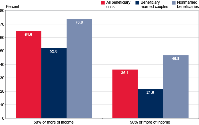
| All beneficiary units | Beneficiary married couples | Nonmarried beneficiaries | |
|---|---|---|---|
| 50% or more of income | 64.6 | 52.3 | 73.8 |
| 90% or more of income | 36.1 | 21.6 | 46.8 |
Aged groups differ in their likelihood of receiving earnings, but not pensions. Earnings are received by a greater percentage of aged units in the youngest group than in the oldest group—49.7% compared with 8.5%. In all age groups, there is little difference in the likelihood of having a public or private pension.
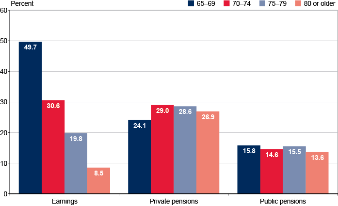
| Age | Earnings | Private pensions | Public pensions |
|---|---|---|---|
| 65 to 69 | 49.7 | 24.1 | 15.8 |
| 70 to 74 | 30.6 | 29.0 | 14.6 |
| 75 to 79 | 19.8 | 28.6 | 15.5 |
| 80 or older | 8.5 | 26.9 | 13.6 |
Receipt of income from major sources varies by race and Hispanic origin. Among units aged 65 or older, whites are more likely than Asians, blacks, or Hispanics to receive Social Security, pensions, and income from assets. Receipt of earnings varies little by race and Hispanic origin. Minority aged units are more likely to receive Supplemental Security Income (SSI) than are whites.
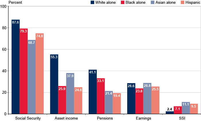
| Major source of income | White alone | Black alone | Asian alone | Hispanic |
|---|---|---|---|---|
| Social Security | 87.6 | 79.3 | 68.7 | 74.8 |
| Asset income | 55.3 | 25.9 | 37.9 | 24.8 |
| Pensions | 41.1 | 33.1 | 21.4 | 19.4 |
| Earnings | 28.6 | 23.8 | 28.8 | 25.5 |
| SSI | 2.4 | 7.1 | 11.1 | 9.5 |
Receipt of Social Security has become nearly universal. In 1962, 69% of units aged 65 or older received Social Security benefits; in 2012, 86% of them did. Most of that increase occurred in the 1960s. Receipt of other pension income, which more than doubled from 1962 to 1992, has decreased slightly since then. The proportion of aged units with asset income, which had been about two-thirds since 1980, has dropped since 1990 and leveled off since 2000. The proportion with earnings has declined since 1971 and has been between 20% and 25% since 1980. The proportion receiving public assistance has also declined and is now about a third of its 1962 level.
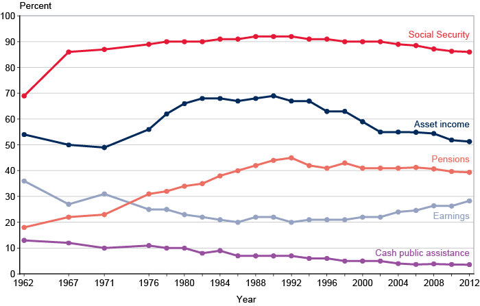
| Year | Social Security | Pensions | Asset income | Earnings | Cash public assistance |
|---|---|---|---|---|---|
| 1962 | 69 | 18 | 54 | 36 | 13 |
| 1967 | 86 | 22 | 50 | 27 | 12 |
| 1971 | 87 | 23 | 49 | 31 | 10 |
| 1976 | 89 | 31 | 56 | 25 | 11 |
| 1978 | 90 | 32 | 62 | 25 | 10 |
| 1980 | 90 | 34 | 66 | 23 | 10 |
| 1982 | 90 | 35 | 68 | 22 | 8 |
| 1984 | 91 | 38 | 68 | 21 | 9 |
| 1986 | 91 | 40 | 67 | 20 | 7 |
| 1988 | 92 | 42 | 68 | 22 | 7 |
| 1990 | 92 | 44 | 69 | 22 | 7 |
| 1992 | 92 | 45 | 67 | 20 | 7 |
| 1994 | 91 | 42 | 67 | 21 | 6 |
| 1996 | 91 | 41 | 63 | 21 | 6 |
| 1998 | 90 | 43 | 63 | 21 | 5 |
| 2000 | 90 | 41 | 59 | 22 | 5 |
| 2002 | 90 | 41 | 55 | 22 | 5 |
| 2004 | 89 | 41 | 55 | 24 | 4 |
| 2006 | 88.5 | 41.3 | 54.9 | 24.6 | 3.7 |
| 2008 | 87.2 | 40.7 | 54.4 | 26.4 | 3.9 |
| 2010 | 86.3 | 39.7 | 51.9 | 26.3 | 3.7 |
| 2012 | 86.0 | 39.4 | 51.3 | 28.3 | 3.6 |
Receipt of asset income is associated with relatively high median income. The median income of units aged 65 or older with asset income is more than twice that of those with no asset income ($41,809 compared with $18,203). Aged units with no asset income are concentrated in the lowest income categories—one-fifth have a total income below $10,000, and approximately one-fourth have an income of $30,000 or more. Among aged units with asset income, 3.7% have a total income of less than $10,000, and over half have an income of $30,000 or more.
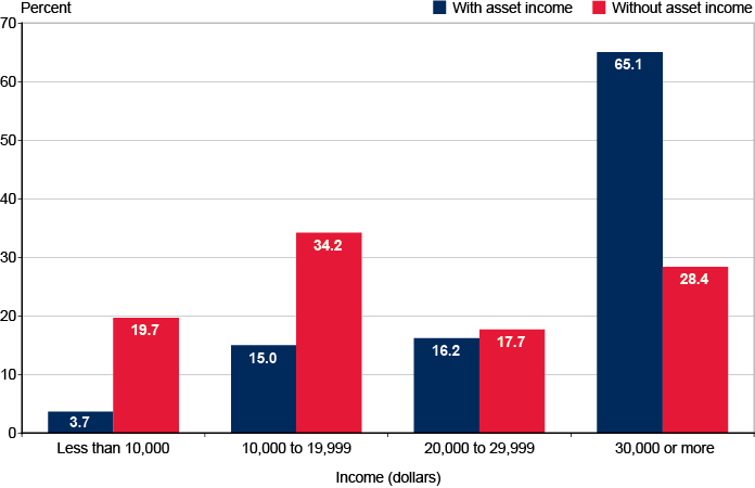
| Income (dollars) | With asset income | Without asset income |
|---|---|---|
| Less than 10,000 | 3.7 | 19.7 |
| 10,000 to 19,999 | 15.0 | 34.2 |
| 20,000 to 29,999 | 16.2 | 17.7 |
| 30,000 or more | 65.1 | 28.4 |
Receipt of earnings and retirement benefits also affects total income. About 11.0% of units aged 65 or older have no retirement benefits. Of those, 55.5% have earnings, and their median income is $55,450; 44.5% have no earnings, and their median income is $0. In the absence of earnings, median income rises markedly with the number of retirement benefit types received, from $16,199 with one retirement benefit type to $34,874 with two. For units with both earnings and retirement benefits, median income is $54,000 for those with one retirement benefit type and $72,718 for those with two.
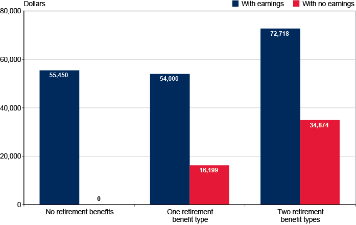
| Receipt of retirement benefits | With earnings | With no earnings |
|---|---|---|
| No retirement benefits | 55,450 | 0 |
| One retirement benefit type | 54,000 | 16,199 |
| Two retirement benefit types | 72,718 | 34,874 |
Shares of Aggregate Income
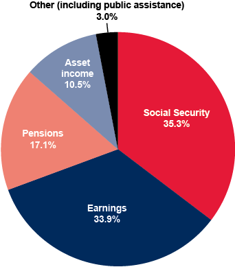
Social Security provides the largest share of aggregate income for units aged 65 or older. Aggregate income for the aged population comes largely from four sources. Social Security accounts for 35.3%, earnings for 33.9%, pensions for 17.1%, and asset income for 10.5%. Only 3.0% comes from other sources.
Shares of aggregate income from each source differ greatly by income level. Units aged 65 or older are ranked by total money income and divided into five groups of equal size called quintiles. The largest share of income for units in the lowest quintile comes from Social Security benefits (83.2%), and cash public assistance provides the second largest share (8.1%). For units in the highest income quintile, earnings provide the largest share of income (49.9%). Pensions, Social Security, and asset income (17.2%, 15.9%, and 14.8%) are similar in importance.
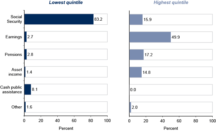
| Source of aggregate income | Percentage of aggregate income for lowest quintile | Percentage of aggregate income for highest quintile |
|---|---|---|
| Social Security | 83.2 | 15.9 |
| Earnings | 2.8 | 17.2 |
| Pensions | 1.4 | 14.8 |
| Asset income | 2.7 | 49.9 |
| Cash public assistance | 8.1 | 0.0 |
| Other | 1.6 | 2.0 |
Over time, Social Security has provided the largest share of aggregate income for units aged 65 or older. In 1962, it provided the largest share, followed closely by earnings. In 2012, Social Security continued to provide the largest share, but by a wider margin compared with the other major sources of income. The share from asset income increased for over 20 years but has generally declined since the mid-1980s. The share from earnings has had the opposite pattern—declining until the mid-1980s and generally increasing since then. The share from pensions had doubled by the early 1990s but has since leveled off.
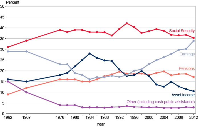
| Year | Social Security | Pensions | Asset income | Earnings | Other |
|---|---|---|---|---|---|
| 1962 | 31 | 9 | 16 | 29 | 15 |
| 1967 | 34 | 12 | 15 | 29 | 10 |
| 1976 | 39 | 16 | 18 | 23 | 4 |
| 1978 | 38 | 16 | 19 | 23 | 4 |
| 1980 | 39 | 16 | 22 | 19 | 4 |
| 1982 | 39 | 15 | 25 | 18 | 3 |
| 1984 | 38 | 15 | 28 | 16 | 3 |
| 1986 | 38 | 16 | 26 | 17 | 3 |
| 1988 | 37.9 | 17.5 | 24.8 | 17.0 | 2.8 |
| 1990 | 36.4 | 18.3 | 24.5 | 17.7 | 3.1 |
| 1992 | 39.5 | 19.6 | 20.6 | 17.1 | 3.2 |
| 1994 | 42.1 | 18.7 | 17.6 | 18.0 | 3.6 |
| 1996 | 40.3 | 18.5 | 18.0 | 20.0 | 3.2 |
| 1998 | 37.6 | 18.7 | 19.9 | 20.7 | 3.1 |
| 2000 | 38.4 | 18.0 | 17.5 | 23.1 | 3.0 |
| 2002 | 39.4 | 19.0 | 13.6 | 24.9 | 3.1 |
| 2004 | 38.6 | 19.7 | 12.6 | 26.3 | 2.7 |
| 2006 | 36.7 | 17.9 | 14.9 | 27.8 | 2.7 |
| 2008 | 36.5 | 18.5 | 12.7 | 29.7 | 2.7 |
| 2010 | 36.7 | 18.6 | 11.4 | 30.2 | 3.1 |
| 2012 | 35.3 | 17.1 | 10.5 | 33.9 | 3.0 |
| Statistic was not produced in 1971. | |||||
Family Income of Persons 65 or Older
The demographic composition of the elderly varies across age groups. The proportion of men to women differs little for ages 65–69, but women 80 or older greatly outnumber men 80 or older. Persons 65–69 are nearly twice as likely to be married than nonmarried, but more than half of persons 80 or older are widowed. Racial and ethnic composition varies across age cohorts as well; the younger cohorts are represented by larger proportions of minorities than the older cohorts. Approximately one-fifth of elderly persons live with nonspouse family, consistent across age categories.
| 65 or older | 65–69 | 70–74 | 75–79 | 80 or older | |
|---|---|---|---|---|---|
| Sex | |||||
| Men | 44.6 | 47.8 | 45.8 | 42.6 | 40.6 |
| Women | 55.4 | 52.2 | 54.2 | 57.4 | 59.4 |
| Marital status | |||||
| Married | 56.6 | 65.3 | 63.4 | 58.5 | 37.7 |
| Nonmarried | 43.4 | 34.7 | 36.6 | 41.5 | 62.3 |
| Widowed | 25.6 | 11.5 | 18.0 | 26.5 | 50.4 |
| Divorced | 11.1 | 15.1 | 12.3 | 9.2 | 6.0 |
| Never married | 4.4 | 5.4 | 4.1 | 4.0 | 3.6 |
| Race | |||||
| White alone | 85.6 | 84.4 | 85.0 | 86.5 | 87.0 |
| Black alone | 9.0 | 9.5 | 9.3 | 8.6 | 8.3 |
| Asian alone | 3.9 | 4.1 | 4.1 | 3.3 | 3.7 |
| Hispanic origin | 7.4 | 8.2 | 7.1 | 7.7 | 6.4 |
| Living with nonspouse family | 22.3 | 23.2 | 20.8 | 20.5 | 23.7 |
| Total number of aged persons (thousands) | 43,287 | 14,437 | 10,264 | 7,598 | 10,988 |
| NOTE: Totals do not necessarily equal the sum of the rounded components. | |||||
The aged are an economically diverse group. The median family income for persons aged 65 or older is $39,196, but there are wide differences within the total group. Approximately 5.9% have family income of under $10,000, and roughly 35.3% have family income of $50,000 or more.
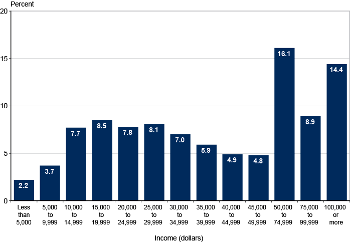
| Income (dollars) | Percent |
|---|---|
| Less than 5,000 | 2.2 |
| 5,000 to 9,999 | 3.7 |
| 10,000 to 14,999 | 7.7 |
| 15,000 to 19,999 | 8.5 |
| 20,000 to 24,999 | 7.8 |
| 25,000 to 29,999 | 8.1 |
| 30,000 to 34,999 | 7.0 |
| 35,000 to 39,999 | 5.9 |
| 40,000 to 44,999 | 4.9 |
| 45,000 to 49,999 | 4.8 |
| 50,000 to 74,999 | 16.1 |
| 75,000 to 99,999 | 8.9 |
| 100,000 or more | 14.4 |
Family total income varies by age and sex. Median family total income is highest for the youngest cohorts. In addition, in all age groups, women have lower median family total income than men, from $47,749 for woman aged 65 to 69 to $25,328 for women aged 80 or older.
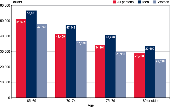
| Age | All persons | Men | Women |
|---|---|---|---|
| 65 to 69 | 51,074 | 56,681 | 47,749 |
| 70 to 74 | 41,469 | 47,342 | 37,008 |
| 75 to 79 | 34,404 | 40,998 | 29,998 |
| 80 or older | 28,798 | 33,600 | 25,328 |
Family median income varies by sex, race, and Hispanic origin. Median family income of men is roughly one-third higher than it is for women. Asians have the highest median family income, followed by whites, Hispanics, and blacks.
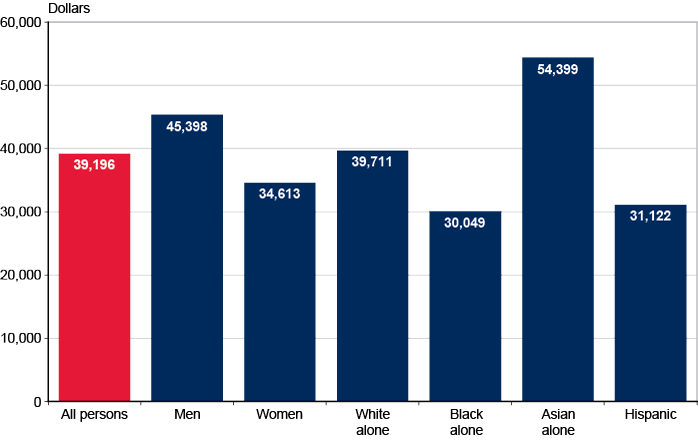
| Sex, race, or Hispanic origin | Dollars |
|---|---|
| All persons | 39,196 |
| Men | 45,398 |
| Women | 34,613 |
| White alone | 39,711 |
| Black alone | 30,049 |
| Asian alone | 54,399 |
| Hispanic | 31,122 |
Family income sources vary by sex. Men are more likely than women to be in families receiving income from any source other than Social Security and public assistance.
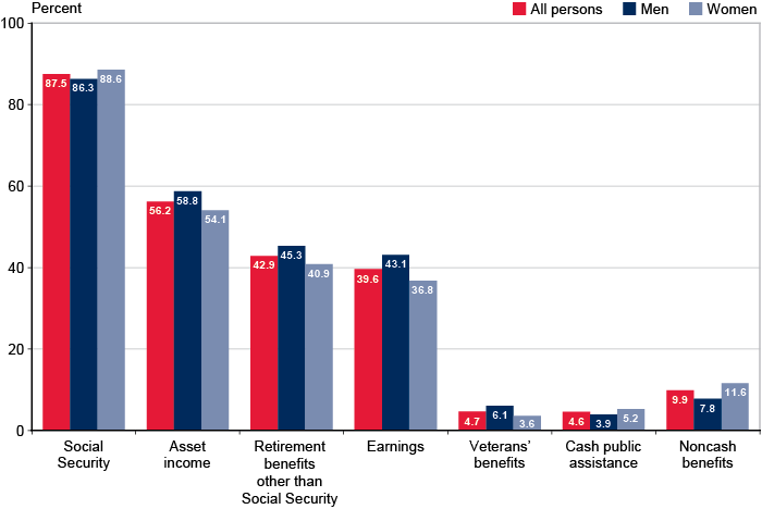
| Source of income | All persons | Men | Women |
|---|---|---|---|
| Social Security | 87.5 | 86.3 | 88.6 |
| Asset income | 56.2 | 58.8 | 54.1 |
| Retirement benefits other than Social Security | 42.9 | 45.3 | 40.9 |
| Earnings | 39.6 | 43.1 | 36.8 |
| Veterans' benefits | 4.7 | 6.1 | 3.6 |
| Cash public assistance | 4.6 | 3.9 | 5.2 |
| Noncash benefits | 9.9 | 7.8 | 11.6 |
Social Security was the major source of family total income for slightly more than half of persons 65 or older in families receiving benefits. For about one-quarter of the elderly, Social Security was most of family total income. Social Security was the predominant source of family income for one-fifth of elderly men in beneficiary families and over one-quarter of elderly women in beneficiary families. Social Security accounted for less than half of family income for nearly half of the elderly men in beneficiary families and 41.1% of elderly women in beneficiary families.
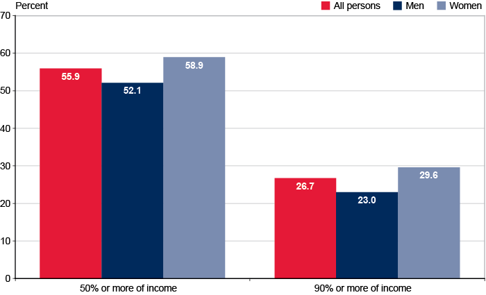
| All persons | Men | Women | |
|---|---|---|---|
| 50% or more of income | 55.9 | 52.1 | 58.9 |
| 90% or more of income | 26.7 | 23.0 | 29.6 |
Poverty Status, Based on Family Income
High proportions of nonmarried and minority persons aged 65 or older are poor or near poor. The variations in family income by sex, marital status, and race are reflected in the poverty rates for those subgroups of the aged. Nonmarried persons, blacks, and Hispanics have the highest poverty rates, ranging from 15.2% to 20.6%. An additional 8.8% to 9.0% of nonmarried persons, blacks, and Hispanics have incomes between the poverty line and 125% of the poverty line (the near poor).
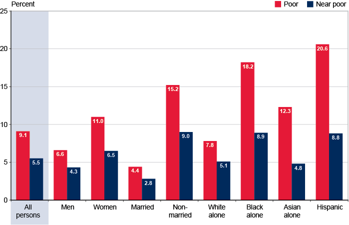
| Sex, marital status, race, or Hispanic origin | Poor | Near poor |
|---|---|---|
| All persons | 9.1 | 5.5 |
| Men | 6.6 | 4.3 |
| Women | 11.0 | 6.5 |
| Married | 4.4 | 2.8 |
| Nonmarried | 15.2 | 9.0 |
| White alone | 7.8 | 5.1 |
| Black alone | 18.2 | 8.9 |
| Asian alone | 12.3 | 4.8 |
| Hispanic | 20.6 | 8.8 |
The oldest age group (80 or older) has the highest poverty rate. In keeping with the lower family income of older age groups, those groups generally have higher rates of poverty and near poverty (income between the poverty line and 125% of the poverty line).
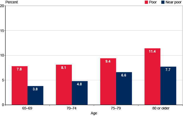
| Age | Poor | Near poor |
|---|---|---|
| 65 to 69 | 7.8 | 3.8 |
| 70 to 74 | 8.1 | 4.8 |
| 75 to 79 | 9.4 | 6.6 |
| 80 or older | 11.4 | 7.7 |
Definitions and Notes
Income Sources
Asset income includes interest, dividends, income from estates or trusts, and net rental income or royalties.
Cash public assistance includes Supplemental Security Income and other cash public assistance payments low-income people receive, such as Aid to Families with Dependent Children (AFDC, ADC), temporary assistance to needy families (TANF), general assistance, and emergency assistance.
Earnings is the sum of income from wages and salaries and income from self-employment.
Noncash benefits include Supplemental Nutrition Assistance Program benefits (SNAP benefits formerly known as food stamps), energy assistance, and housing assistance. Noncash benefits are not included as money income for public assistance or total income.
Retirement benefits include Social Security, other public sources such as Railroad Retirement and government employee pensions (military, federal, state, and local), and private pensions and annuities.
Social Security includes retired-worker benefits, dependent or survivor benefits, disability benefits, transitionally insured benefits, and special age-72 benefits.
Pensions include regular payments from private pensions and annuities; government employee pensions; Railroad Retirement; and individual retirement accounts (IRAs), Keoghs, and 401(k) plans. Irregular withdrawals (lump-sum payments) from IRAs, Keoghs, and 401(k) plans are not included in the data because they do not fit the Census Bureau's definition of money income.
Income
Total money income is the sum of all income received by the aged unit before any deductions such as taxes, union dues, or Medicare premiums. Total money income does not reflect nonmoney transfers such as SNAP benefits, health benefits, subsidized housing, payments in kind, or fringe benefits from one's employment. Total money income does not include capital gains or losses, or irregular withdrawals (lump-sum payments) from IRAs, Keoghs, or 401(k) plans.
Aggregate income is the sum of the total money income of all aged units in the population of interest. Several charts in this book present the shares of aggregate income attributable to specific sources, such as Social Security.
Source of Data
Data for this series are from the March Current Population Survey (CPS) of the U.S. Census Bureau. The CPS samples a large cross section of households in the United States each year (approximately 98,000 in March 2013). The March supplement gathers detailed information on income and labor force participation of each person 15 years of age or older in the sample households.
General Notes
This publication covers the population aged 65 or older. The unit of analysis here, with the exception of the measures of poverty and family income of persons, is the aged unit, which is a married couple living together or a person who does not live with a spouse. A married couple's age is defined as the age of the husband—unless he is under age 55 and the wife is 55 or older, in which case it is the age of the wife. The race and Hispanic origin of a married couple are determined by the husband. The unit of analysis for family income of persons and poverty is persons aged 65 or older.
Beginning with data for 2002, respondents may identify themselves in more than one racial group. The “White alone” and “Black alone” categories reflect respondents who reported only one race.
All years are calendar years.
Nonmarried men and nonmarried women include persons who are separated or married but living apart from their spouse.
Persons of Hispanic origin may be of any race.